New Identity for ICSD
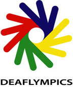
It is with great pleasure to present a new identity for ICSD with a new logo design. The logo designer is Mr. Ralph Fernandez, a 1985 silver medallist in 1000m-sprint cycling. Mr. Fernandez, a professional graphic and web designer, was selected among deaf designers to finalize the design.
The new logo design was to convey a positive message to all audiences with a warm and humanistic touch, which would be easily interpreted and understood by both deaf and hearing audiences all over the world.
The logo was also intended to embrace a wide range of cultures with the use of bold international colors.
The colors of red, blue, yellow and green were chosen to represent 4 senses (smell, feel, see, and taste without the 5th sense – hear), the four (4) regional confederations of ICSD and the initial letters of the founding organization- Comite International des Sports des Sourds (CISS). The four colors are those that appear on all national flags of the world.
The objective of utilizing 4 hand shapes was to create a symbol with a positive connotation- “OK”, “good”, “great” and “united” in international signs.
The center of the logo represents the iris of the eye, which defines deaf people as visual people as they use their eyes to communicate.
The newly designed logo shall be a powerful symbol of the international deaf sports community and ties together strong elements: sign language, deaf international cultures, unity and continuity.
The motto-“Equal through Sports” remains intact, as it continues to demonstrate that deafness shall not be viewed as a disability in sports.